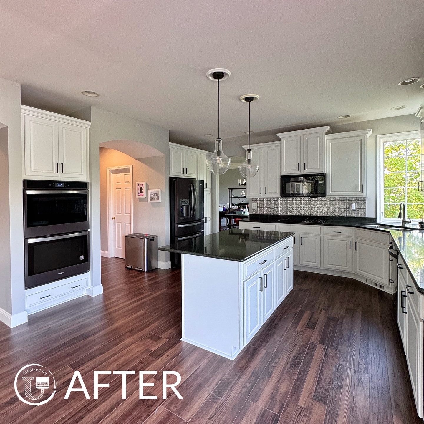
Color Harmony: Expert Tips for Balancing Hues in Interior Designs Jul 10, 2025
Understanding color harmony starts with familiarizing yourself with the color wheel—a tool that designers use to create visually appealing combinations. Complementary colors, which are opposite each other on the wheel, such as blue and orange, often create vibrant and dynamic spaces. In contrast, analogous color schemes, which use colors next to each other like blue and green, provide a more soothing and coordinated appearance.
When planning your interior design, consider the mood you want each room to convey. Warm colors, like reds and yellows, can make a space feel cozy and energizing, ideal for social areas like the living room or kitchen. Cool tones, including blues and greens, introduce a sense of calmness, perfect for bedrooms and bathrooms.
Balancing hues also involves understanding the primary colors—red, blue, and yellow—as these can be mixed to create secondary colors like green, orange, and purple. Mastering the balance between these primary and secondary color palettes can prevent your space from being too monotonous or overly chaotic.
Remember to consider the role of neutral colors in creating balance. Neutrals like whites, grays, and beiges act as a buffer, keeping vivid colors from overwhelming the space. They can ground a room, providing a backdrop that allows bolder accents to shine without competing for attention.
Another key consideration is the lighting in your home. Natural and artificial lighting can dramatically impact how colors appear. A room with ample natural light can handle darker, richer colors, while a space with limited light may benefit from lighter shades to avoid feeling closed in. Testing color swatches in different lighting conditions throughout the day can be invaluable in predicting how a color will truly live in your space.
Furthermore, texture plays a significant role in balancing colors in interior design. Various finishes, like matte, satin, and gloss, react to light differently and can subtly influence the perception of color. Incorporating diverse materials through fabrics, woods, and metals can add depth and interest to your space without altering the basic color scheme.
When embarking on a home renovation, it's crucial to maintain a consistent color palette throughout the house. This doesn't mean every room must look the same, but there should be a unifying element that ties the spaces together. This could be achieved through accent colors or architectural features like trim and molding.
Lastly, don't forget the personal element—your home should reflect your personality. While it's essential to adhere to the principles of color harmony, some of the best spaces creatively subvert the rules to create something unique and personal.
In conclusion, color harmony in interior design is about thoughtful planning and intelligent use of the color wheel, lighting, textures, and personal style. At Inspired By U, we're here to help you find the perfect balance that not only enhances your space but also elevates your everyday living experience. Embrace the process, experiment, and enjoy the transformational power of color.
/filters:no_upscale()/filters:format(webp)/media/2a2615cf-e357-40a3-b156-999c4adf2620.jpeg)